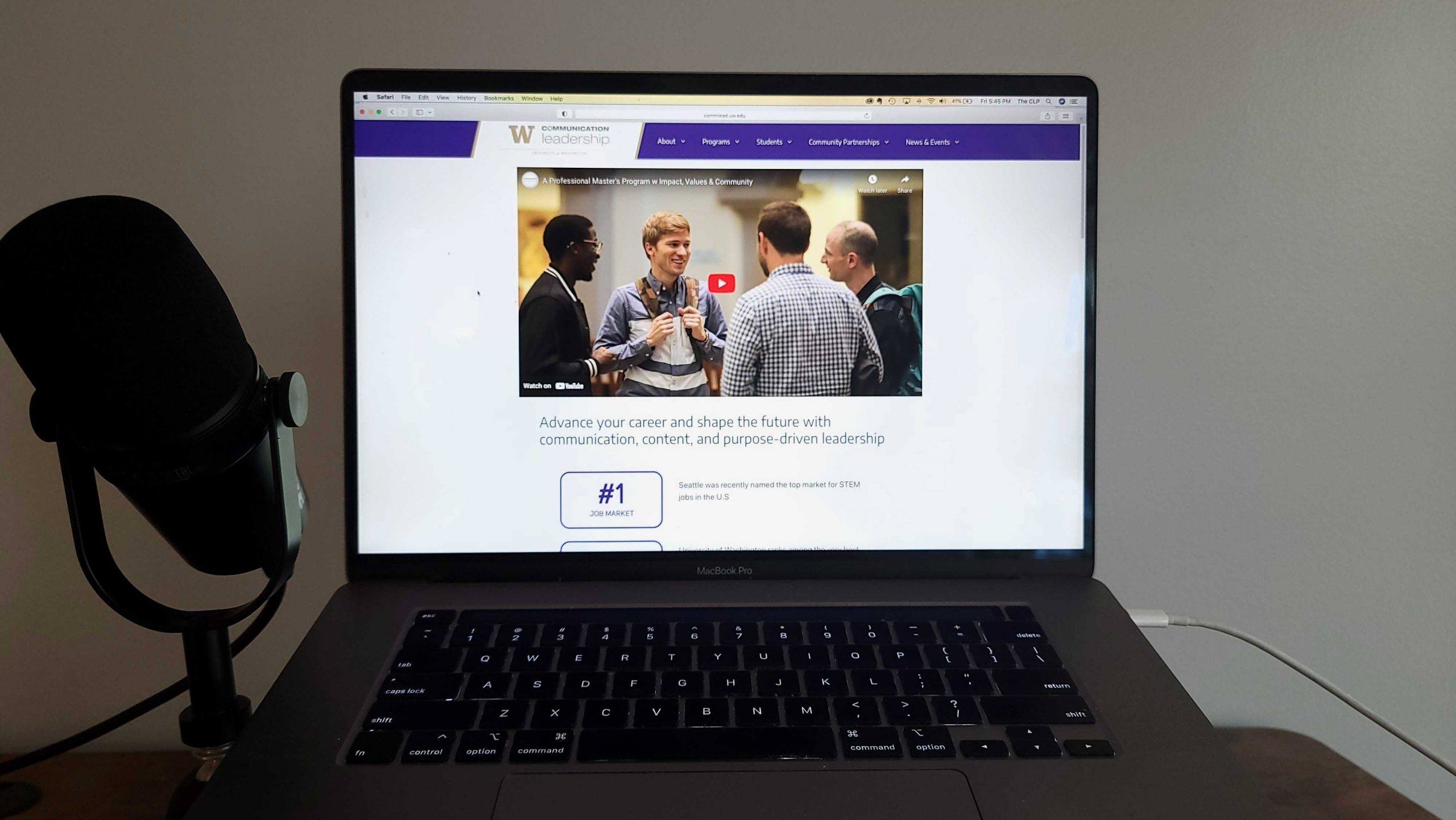
Welcome to the new Communication Leadership website! Over the past year we’ve utilized the extraordinary expertise of our students, staff, and faculty, to redesign this space to better serve the needs of our community. Under the direction of Communication Leadership faculty Misty Weaver, a team of four students combined their different areas of expertise to tackle the challenge of rebuilding the site, with several others joining for the implementation.
Step 1: Research
We focused on three groups of website users, prospective students, current students, and program partners – with a goal of more effectively promoting the program across these groups. To better understand what these different users were looking for on the website, we conducted user surveys and interviews of prospective and current students, as well as students who applied but ultimately declined to join the program. We also used TreeJack to test different users’ navigation preferences.
One of our key findings was that students ultimately want to know that the Communication Leadership program will help their career when deciding to apply. Our old website was failing to convey that information in several ways. Survey respondents had a hard time finding the information they were looking for such as course descriptions, career paths, or specific degree programs. Often it was buried or not where they were expecting in the navigation. Users also said they were confused about Communication Leadership’s relationship with the University of Washington. The website’s visual design didn’t connect with the rest of UW’s branding and attending a top university often played into students’ decision to apply or not.

Step 2: Content Audit
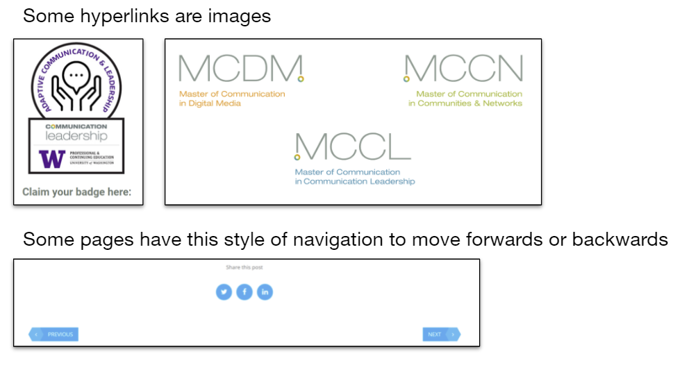
The user research results were consistent with some of the problems discovered during the content audit. Inconsistency in navigation elements like buttons, link styles, and clickable images confused users. We also found that many links, including some in our top navigation, led away from the site, making it difficult for students to go back and forth. The audit also looked at the website’s accessibility. Key accessibility features include consistent headings, left-aligned text, and avoiding terms like “click here” or “learn more” as hyperlinks in favor of more descriptive titles, recommendations we designed into our new site.


The combination of these two important research steps helped us put together a new site map, with more efficient user pathways and easier access to the information our key user groups were looking for. It also gave us a start with guidelines for re-writing the website content and knowing design elements we needed to re-imagine.
Step 3: Content Revision
Now that we had a good framework for what content would live where, it was time to write some of that content. We wanted to make sure we had consistent messaging across the website that reflects the Communication Leadership program’s unique characteristics and connected with our target audiences; prospective students, current students, and partners.
Communication Leadership staff participated in a card sorting task to give us an idea of how they saw the program’s brand. We combined the results of that card sort with information from student interviews to come up with four brand terms: Professional, impactful, community-driven, and values-based. The content across the website is written based on messages that communicate this brand, tailored to each of our audiences. We also wrote a voice and tone guide to encourage a consistent writing style.
Step 4: Visual Design
We designed several variations of a new logo and site styles that combined our existing branding with the broader university branding. We brought all of the new pieces of the website using Figma, where we created mockups of the new pages. Buttons, hyperlink styles, fonts, and page layout were standardized and recorded in a brand new style guide. We were also able to go back and edit the content, with a better idea of what it would look like on the page.
Step 5: Implementation
We had all the elements of a new site: navigation, content, and visual design. Now to actually build it! UW Department of Communication IT staff developed new template designs to match the design mock-ups. Students stepped back in to help with the hard work of identifying and fixing bugs, and porting over existing content.
Now it’s finally time for the big reveal (and maybe a little more troubleshooting!)
Jokes aside, we’re confident this new website will better serve users, because we followed the methods and best practices that are espoused in our curriculum, from careful research and testing, to inclusive design, to accessible, authentic content creation. Leveraging our student talent and faculty knowledge, we’re proud to lead with exemplary communication. We hope this new site reflects the amazing program we are all a part of.
Thank you to the amazing team that put the new website together:
Lexi Zhang – User Research
Max Jensen – Content Audit
Hannah Wheeler – Content Revision & Writing
Haopeng Liu – Web Design
Nick Myers – Web Development
Zoie Huang, Valeska Frias – Implementation
Misty Weaver – Faculty Advisor
Alex Stonehill – Content Lead & Project Oversight

 University of Washington